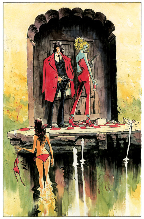
This week, both Bá and I did new original drawings for the annual CBLDF auction that takes place in San Diego during Comic Con. We took some time from our crazy-busy schedules (made even crazier by the fact that World Cup is going on just outside our studio window) and created two new images with characters we have created. TFAW, who always helps coordinate this, will make prints of the images that the artists will be able to keep and sell, so I decided to make a full color image that would make a great 10 x 17 print.

My first idea was to do a Sugarshock image. Everybody seems to really love those characters, and you could say that right now Joss Whedon, writer of Sugarshock and nowadays writer and director of the Avengers movies, has never been as popular. I sketched the characters on my notebook and started working on the final image, but something wasn't clicking and I wasn't happy with where I was going with the drawing. I decided to call it a day and get back to it the next morning, and I'm glad I did.
Next morning, I went looking for inspiration at one of my sources: Pinterest. I used to keep thousands of images in folders on my computer, but nowadays it's much easier to keep everything I think might inspire an illustration or a story on my Pinterest page. If you go check it out, you'll find elements of my recent CMKY stories for Vertigo, as well as research for the short Hellboy story, and many other images from across the internet that I keep in handy to mix up in my head when I'm at the drawing board.
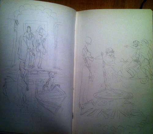
The new wave of inspirational images made me decide to change characters, and the drawing became a Casanova image. It's easier to imagine Casanova in any situation, anywhere, with anyone. Much more pleased with this second sketch, I showed it to Bá:
"It's great", he said, "but lose the cheetah and the boat". I agreed and started working on the final piece.

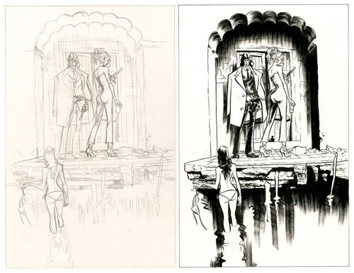
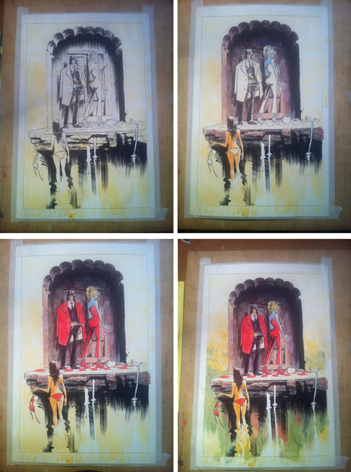
I took pictures of the process to post on twitter, and it's a great way to see the way I was thinking visually, how I left many decisions for the inking stage, how I helped to make the characters pop by using cool darker colors on the background, how the red elements united the characters, how dripping and large expressive brushstrokes help give it a "drawing" look, a "hand-made" look.

After it was done, dry and ready, I scanned it, adjusted the colors on photoshop and sent it over by email. The original will be going with me to San Diego, where I shall say farewell to this painting, hoping it will find a great new home on the collection of some lucky fan.

Saturday, June 28, 2014
Casanova step-by-step
Posted by
Fábio Moon
at
2:53 PM
![]()
Labels: auctions, casanova, CBLDF, original pages, sdcc, Sugarshock
Subscribe to:
Post Comments (Atom)


No comments:
Post a Comment